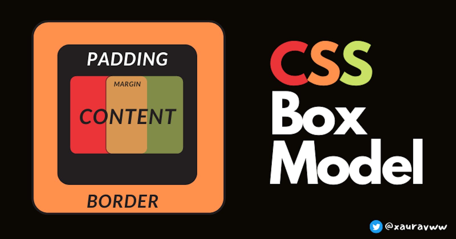
Learn CSS Box Model with Examples
CSS Box Model : Content , Padding , Border , Margin
Table of contents
In this blog we will learn CSS Box Model and its Properties with Examples.
Everything is represented by a box in CSS.
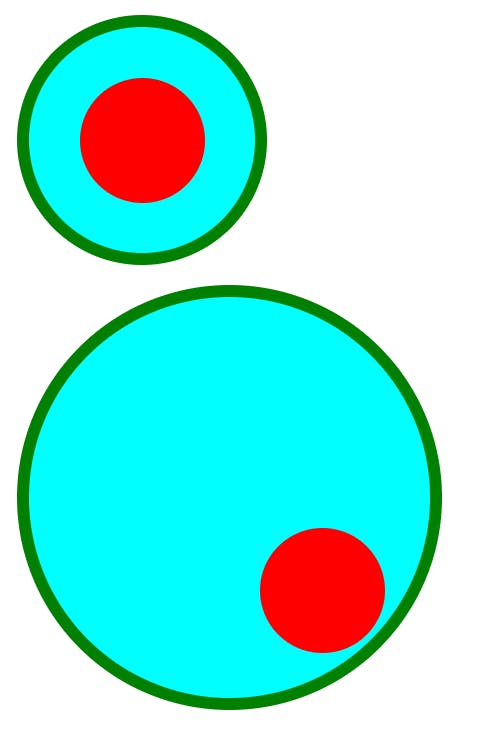
For example if we want to create a circle or we want browser to interpret our rectangular box as a circle then we can make a circle by changing the border-radius to 100%.
Box Model has 4 parts
- content
- padding
- border
- margin
Content
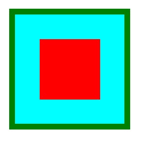
Everything inside the box is called content . Here whatever inside the green border , is content for outer box . Also the box inside it which has border of 0 and the content is red color for inner box.
<body>
      <div class="bigBox">
        <div class="box"></div>
      </div>
    </body>
* {
  box-sizing: border-box;
  margin: 0;
}
.box {
  width: 100px;
  height: 100px;
  background-color: red;
  padding: 0.15rem;
  padding-top: 2rem;
  margin: 1.5rem;
  margin-top: 1.5rem;
}

.bigBox {
  background-color: aqua;
  width: 200px;
  height: 200px;
  margin: 1rem;
  padding: 1rem;
  border: 10px solid green;
}
Padding
When we want to add extra space between our content and the border , we use padding . It is helpful when we want to add extra space without changing the content size.
Even after increasing class
.bigBoxpadding , it has no affect on the size of content.
<body>
      <div class="bigBox">
        <div class="box"></div>
      </div>
      <div class="bigBox1">
        <div class="box1"></div>
      </div>
    </body>
  </body>
* {
  box-sizing: border-box;
  margin: 0;
}

.bigBox,
.bigBox1 {
  background-color: aqua;
  width: 200px;
  height: 200px;
  margin: 1rem;
  padding: 10rem;
  border: 10px solid green;
  border-radius: 100%;
}

.box,
.box1 {
  width: 100px;
  height: 100px;
  background-color: red;
  padding: 0.15rem;
  padding-top: 2rem;
  margin: 1.5rem;
  margin-top: 1.5rem;
  border-radius: 100%;
}

.bigBox {
  padding: 1rem;
}
Border
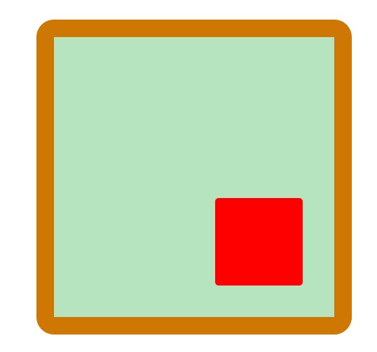
It is the last part of our CSS model . It ontributes to the overall size of our CSS box model. It is between the padding and outside part of that element.
<body>
    <div class="bigBox">
      <div class="box"></div>
    </div>
  </body>
* {
  box-sizing: border-box;
  margin: 0;
}
body {
  display: flex;
  justify-content: center;
  height: 100vh;
  align-items: center;
}
/* Ignore the body code for once , if you don't know flexbox */
.box {
  width: 100px;
  height: 100px;
  background-color: red;
  padding: 0.15rem;
  padding-top: 2rem;
  margin: 1.5rem;
  margin-top: 1.5rem;
  border-radius: 4px;
}

.bigBox {
  background-color: rgba(60, 183, 85, 0.376);
  width: 200px;
  height: 200px;
  margin: 1rem;
  padding: 10rem;
  border: 20px solid rgb(207, 119, 3);
  border-radius: 20px;
}
Margin
It contributes to the distance between different elements inside the body.
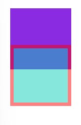
In normal document flow( without using float , flex , grid etc.) if we have two siblings elements have some margin then only the largest of the two margins is used as space between these two elements.
<body>
    <div class="bigBox">
<div class="box"></div>
     </div>
  </body>
* {
  box-sizing: border-box;
  margin: 0;
}
.box {
  width: 100px;
  height: 100px;
  background-color: red;
  padding: 0.15rem;
  padding-top: 2rem;
  margin: 1.5rem;
  margin-top: 1.5rem;

}

.bigBox {
  background-color: aqua;
  width: 200px;
  height: 200px;
  margin: 1rem;
  padding: 1rem;
  border: 10px solid green;
}
Box Sizing
Without box-sizing:border-box our component will look like this.
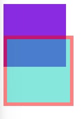
Even boxes are of same size , but when we change it size it only applies to content only. But if we want to change the size of any component including its border , then we use box-sizing.
<body>
      <div class="box1"></div>
      <!-- atleast add some text to make it visible or change it CSS style -->
      <div class="box2"></div>
    </body>
* {
  box-sizing: content-box; /* by default it is set to content-box */
  margin: 10px;
}

.box1 {
  background-color: blueviolet;
  width: 100px;
  height: 100px;
}

.box2 {
  background-color: rgb(12, 206, 187);
  width: 100px;
  height: 100px;
  margin-top: -50px;
  opacity: 0.5;
  border: 6px solid red;
}
Comment if I have committed any mistake. Let's connect on my socials. I am always open for new opportunities , if I am free :P
