Make your Webpage Responsive using CSS Grid Layout
Grid, Grid Template, grid-auto-flow , grid-template-areas , Gaps and its filling, Responsiveness

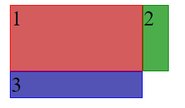
CSS Grid is a layout consists of rows and columns , used to align items wth the help of rows and columns.
<body>
    <div class="container">
      <div class="item1">1</div>
      <div class="item2">2</div>
      <div class="item3">3</div>
    </div>
  </body>
 .container {
        display: grid;
        grid-template-columns: 100px 20px;
        grid-template-rows: 50px;
      }
      .item1 {
        background-color: rgb(213, 92, 92);
        border: 1px solid red;
      }
      .item2 {
        background-color: rgb(75, 174, 75);
        border: 1px solid green;
      }
      .item3 {
        background-color: rgb(83, 83, 181);
        border: 1px solid blue;
      }
shorthand property grid-template: rows /cols
suppose we are adding some more items in our container then it will apply grid-template-rows or grid-template-property till where it is defined , after that grid will not applied until unless you don't define those rows or columns in grid-template.
But you can use grid-auto-columns or grid-auto-rows to change the default CSS style (like size of rows and columns) on the rows and columns which are not defined in grid.
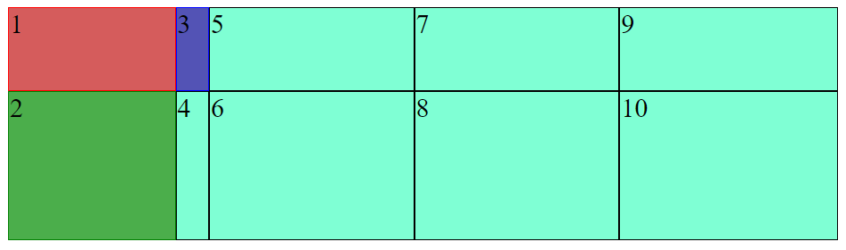
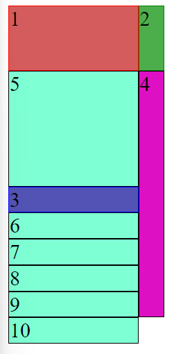
before using grid-auto-columns or grid-auto-rows
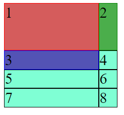
Item no. 4,5,6,7,8 are not defined in template of grid. So they are using default style defined in .item class.
<body>
    <div class="container">
      <div class="item1 item">1</div>
      <div class="item2 item">2</div>
      <div class="item3 item">3</div>
      <div class="item4 item">4</div>
      <div class="item5 item">5</div>
      <div class="item6 item">6</div>
      <div class="item7 item">7</div>
      <div class="item8 item">8</div>
      <div class="item9 item">9</div>
      <div class="item10 item">10</div>
    </div>
  </body>
 .item {
        background-color: aquamarine;
        border: 1px solid black;
      }
      .container {
        display: grid;
        grid-template-columns: 100px 20px;
        grid-template-rows: 50px;
      }
      .item1 {
        background-color: rgb(213, 92, 92);
        border: 1px solid red;
      }
      .item2 {
        background-color: rgb(75, 174, 75);
        border: 1px solid green;
      }
      .item3 {
        background-color: rgb(83, 83, 181);
        border: 1px solid blue;
      }
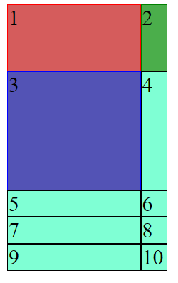
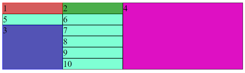
After using grid-auto-columns or grid-auto-rows
 .item {
        background-color: aquamarine;
        border: 1px solid black;
      }
      .container {
        display: grid;
        grid-template-columns: 100px 20px;
        grid-template-rows: 50px;

        grid-auto-columns: 100px 50px 80px;
        grid-auto-rows: 100px 20px;
      }
      .item1 {
        background-color: rgb(213, 92, 92);
        border: 1px solid red;
      }
      .item2 {
        background-color: rgb(75, 174, 75);
        border: 1px solid green;
      }
      .item3 {
        background-color: rgb(83, 83, 181);
        border: 1px solid blue;
      }
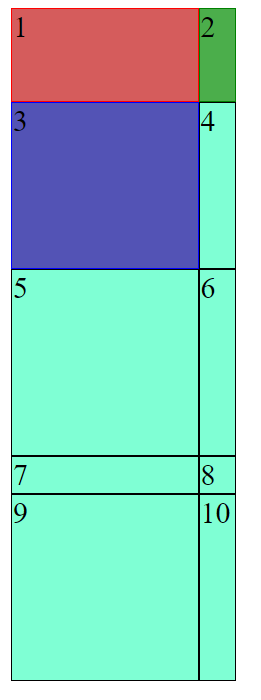
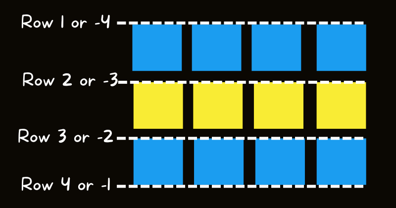
How to define where to add our new element in grid?
This can be done by grid-auto-flow property.
By default it is set to row.
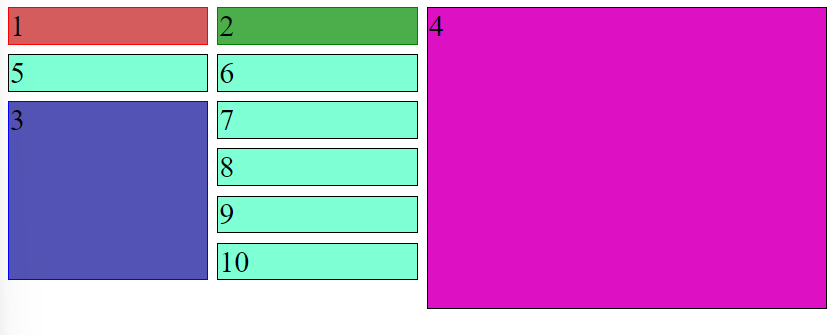
Before setting grid-auto-flow:column
After setting grid-auto-flow:column
You can clearly see that each new element is added to new column.
Defining areas to place items
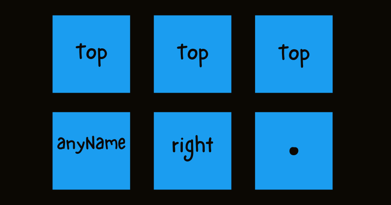 We can include any name. For reference I have used "top" , "anyName" and
 .(period symbol).
.(period symbol) is used when we want to specify any random element here that fits this space.
This can be done using grid-template-areas
I am using prevoius code example to show you the usage of this property.
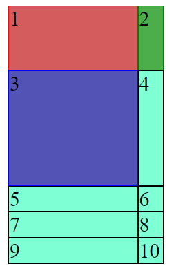
After using this grid-template-areas property
First read this code carefully , then i will explain it.
 .item {
        background-color: aquamarine;
        border: 1px solid black;
      }
      .container {
        display: grid;
        grid-template-columns: 100px 20px;
        grid-template-rows: 50px 89px;

        grid-template-areas:
          "top top "
          "left right";
      }
      .item1 {
        background-color: rgb(213, 92, 92);
        border: 1px solid red;
        grid-area: top;
      }
      .item2 {
        background-color: rgb(75, 174, 75);
        border: 1px solid green;
        grid-area: right;
      }
      .item3 {
        background-color: rgb(83, 83, 181);
        border: 1px solid blue;
      }
      .item4 {
        grid-area: left;
      }
I have also added grid-area: area-name property in each element which I want to include in these grid-template-areas.
In grid-area: area-name don't put area-name in any quotes like we do in our other CSS properties.
PS: Practice this property using differrent different variations.
another way to define the area of a particular grid element
We can do this using grid-row-start & grid-row-end
Also by using grid-column-start & grid-column-end
Shorthand property to do above two properties grid-column: start / end and grid-row: start / end
Similarly we can consider for columns also.
Span attribute is followed by starting point tells that it will stop use the grid area from starting point value to the end of row/column.
 .item {
        background-color: aquamarine;
        border: 1px solid black;
      }
      .container {
        display: grid;
        grid-template-columns: 100px 20px;
        grid-template-rows: 50px 89px;
      }
      .item1 {
        background-color: rgb(213, 92, 92);
        border: 1px solid red;
        grid-column: 1 / -1;
      }
      .item2 {
        background-color: rgb(75, 174, 75);
        border: 1px solid green;
        grid-column: 1 / -1;
      }
      .item3 {
        background-color: rgb(83, 83, 181);
        border: 1px solid blue;
        grid-row: 3 / 7;
      }
      .item4 {
        background-color: rgb(222, 16, 195);
        grid-row: span 9;
      }
Also we can move any elment to a specific row no.or column no. by using this property in specific item.
  grid-row: 5 ;
/* moves the item7 to row no. 5 */
}
Try it yourself by taking more examples.
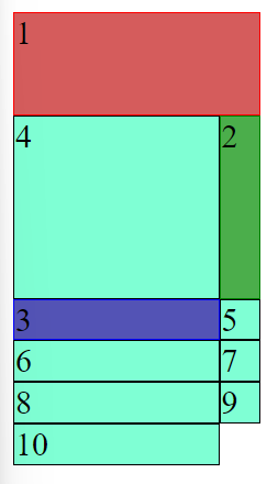
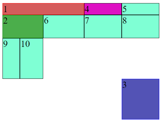
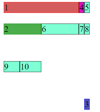
Filling Up Missing Gap
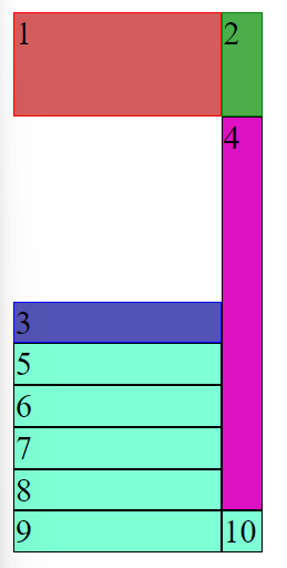
Sometimes any of our item doesn't fit to the area. We can fill taht gap using grid-auto-flow: row dense or grid-auto-flow: column dense property.
But order of the items can be affected using this.
 .item {
        background-color: aquamarine;
        border: 1px solid black;
      }
      .container {
        display: grid;
        grid-auto-flow: row dense;
        grid-template-columns: 100px 20px;
        grid-template-rows: 50px 89px;
      }
      .item1 {
        background-color: rgb(213, 92, 92);
        border: 1px solid red;
      }
      .item2 {
        background-color: rgb(75, 174, 75);
        border: 1px solid green;
      }
      .item3 {
        background-color: rgb(83, 83, 181);
        border: 1px solid blue;
        grid-row: 3 / 7;
      }
      .item4 {
        background-color: rgb(222, 16, 195);
        grid-row: span 9;
      }
Making grids more responsive using minmax( ) , repeat( ) , fr
minmax( ) takes two arguments, first is minimum value and second is maximum-value . If content is overflowing then maximum-value will be used.
repeat( ) takes two arguments first is the no. of repetition and second is the size during each repetition.
fr is a new unit of length in CSS which represents the fraction of available space in the grid container.
 .container {
        display: grid;
        grid-auto-flow: row dense;
        grid-template-columns: 1fr 1fr 2fr;
        grid-template-rows: repeat(2, 50px), minmax(100px, auto);
      }
Adding gaps in grid rows/columns
.container {
        display: grid;
        grid-auto-flow: row dense;
        grid-template-columns: 1fr 1fr 2fr;
        grid-template-rows: repeat(2, 50px), minmax(100px, auto);
        /* row-gap: 5px;
        column-gap: 5px; */
        gap: 5px;
      }
row-gap:size and column-gap:size are used to define gaps. Also there is a shorthand property to do this.
Note: We can also use ```align-items``` and ```justify-content``` , ```align-self``` in this.
### Before using ```align-items``` and ```justify-content
After using align-items and justify-content
 .item {
        background-color: aquamarine;
        border: 1px solid black;
      }
      .container {
        display: grid;

        grid-template-columns: 30px 40px 70px;
        grid-template-rows: 20px 40px;
        grid-template-areas:
          "a a a"
          "b b .";
        height: 200px;
        justify-content: center;
        align-items: flex-end;
      }
      .item1 {
        background-color: rgb(213, 92, 92);
        border: 1px solid red;
        grid-area: a;
      }
      .item2 {
        background-color: rgb(75, 174, 75);
        border: 1px solid green;
        grid-area: b;
      }
      .item3 {
        background-color: rgb(83, 83, 181);
        border: 1px solid blue;
        grid-area: c;
      }
      .item4 {
        background-color: rgb(222, 16, 195);
      }
Comment if I have committed any mistake. Let's connect on my socials. I am always open for new opportunities , if I am free :P


