Multi Column Layout in CSS
column-count ,column-width, column-rule , column-gap, column-fill , column-span


Using Multi-Column layout we can create newspaper type text in multiple columns.
<body>
<div class="container">
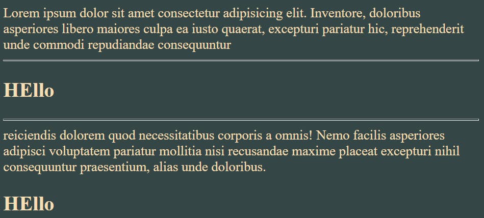
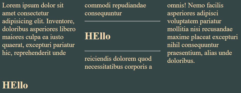
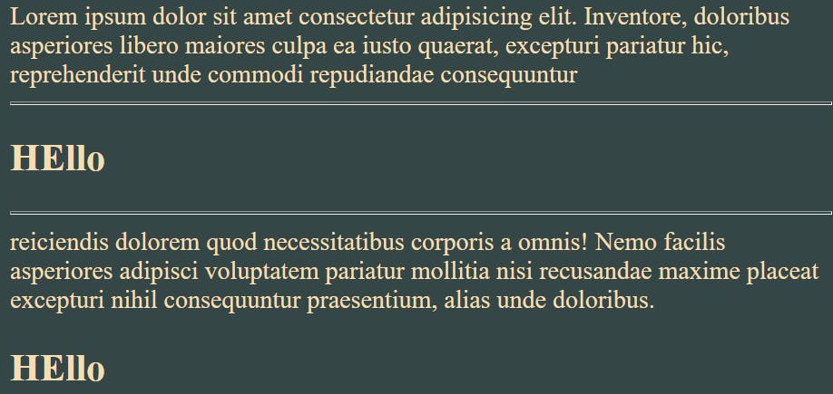
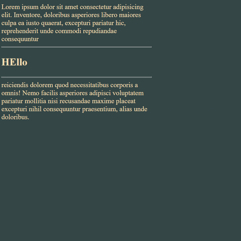
Lorem ipsum dolor sit amet consectetur adipisicing elit. Inventore,
doloribus asperiores libero maiores culpa ea iusto quaerat, excepturi
pariatur hic, reprehenderit unde commodi repudiandae consequuntur
<hr />
<h2>HEllo</h2>
<hr />
reiciendis dolorem quod necessitatibus corporis a omnis! Nemo facilis
asperiores adipisci voluptatem pariatur mollitia nisi recusandae maxime
placeat excepturi nihil consequuntur praesentium, alias unde doloribus.
</div>
<h2>HEllo</h2>
</body>
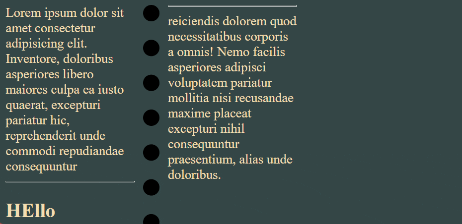
First we will use the column-count: no. of parts property to divide the columns in parts.
Before using column-count property
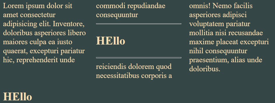
After using column-count property
 body {
        background-color: rgb(52, 70, 70);
        color: wheat;
      }
.container{
  column-count: 3;
}
We can see that after using column-count property our text is divided into 3 columns.
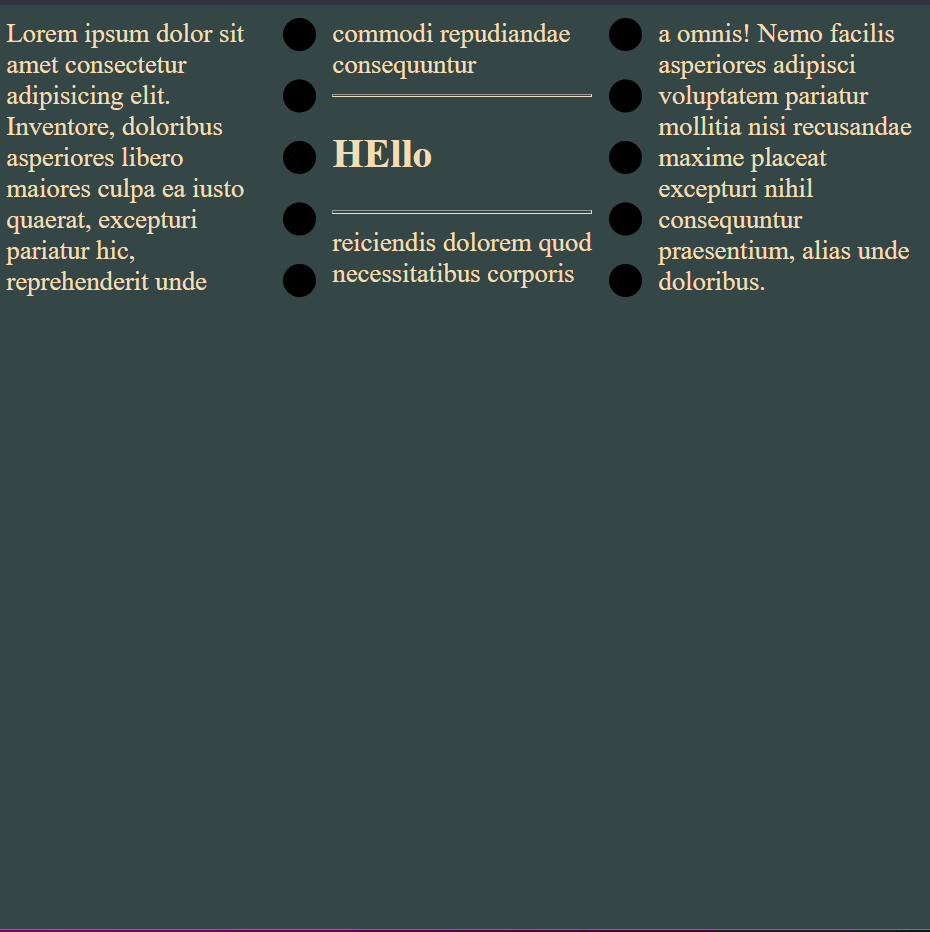
column-width
Using this property we can specify the maximum possible width of a column.
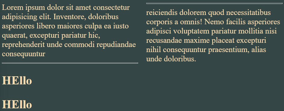
.container{
  column-width: 200px;
}
Also we can try one more shorthand property i.e.
columns: column-width column-count ;
.container{
   columns: 100px 3;
}
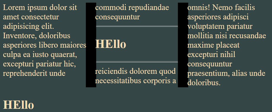
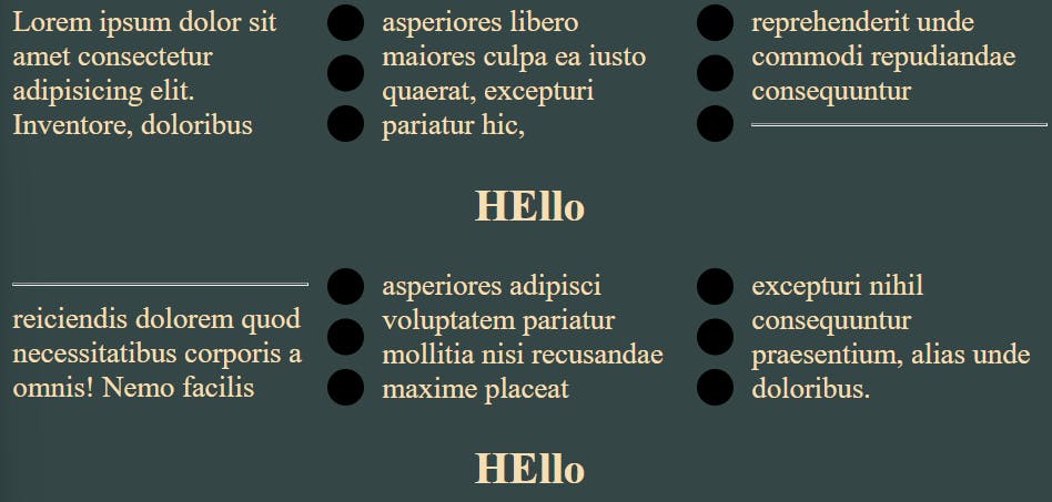
column-rule
Using this property we can add a ruler/vertical line between the columns.
But is the below screenshot I haven't decreased the size of column-width , so it will not display any rule between the columns , as each column is spanning the whole column.
body {
        background-color: rgb(52, 70, 70);
        color: wheat;
      }
.container {
        column-count: 3;
        column-width: 400px;
        column-rule: 20px solid black;
}
So let's decrease the column-width
.container {
        column-width: 100px;
}
We have used a shorthand property but there is also a direct property to change style of column-rule.
This can be done using column-rule-style .
Similarly for color we can use this column-rule-color .
Try and practice these properties by your own .
But our column-rule is still overlapping the text . So let's add some more gap between these columns.
Using column-gap property
This property adds the gap between the columns (if columns exist).
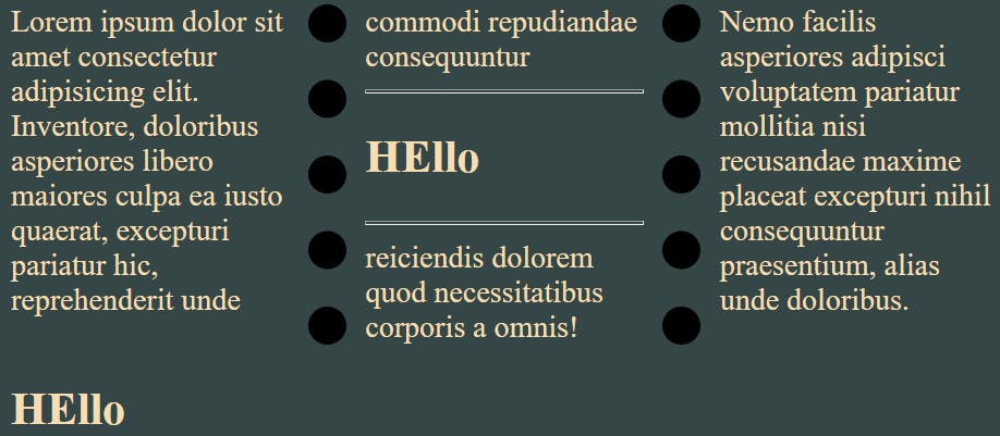
 .container{
column-rule-style: dotted;
        column-gap: 40px;
}
Using column-fill property
At first I am setting the container height to the height of the viewport.
After that we can easily demonstrate the working of column-fill property.
By default column-fill property is set to auto . After adding height:100vh to the container , it will first cover our entire height then it will start filling the next column.
After reducing its viewport size it fills up other columns also.
Now setting column-fill to balance .
It doesn't care about the size of viewport . First it will fill the remaining columns from left to right then it will move to bottom side.
column-span property
It tells how many columns the selected element span across.
By default it is set to none.
We can set it to all .
For illustrating how this property works , I am applying this property on first header.
h2 {
        column-span: all;
        text-align: center;
      }
Comment if I have committed any mistake. Let's connect on my socials. I am always open for new opportunities , if I am free :P