Understand how CSS Units works in a Easy Way
Absolute Units , Relative Units , Viewport , Modifiers
- Absolute Units
- Relative Units
Absolute Units
It has fixed size, depends on screen to screen. (means not independent of machine).
| Units | Description |
| cm | centimeters |
| mm | millimeters |
| in | inches (1in = 96px = 2.54cm) |
| px * | pixels (1px = 1/96th of 1 in) |
| pt | points (1pt = 1/72 of 1 in) |
| pc | picas (1pc = 12 pt) |
Relative Units
This size is not flxed.
| Units | Description |
| ex | Relative to the x-height of the current font (rarely used) |
| ch | Relative to width of the "0" (zero) |
| rem | Relative to font-size of the root element |
| % | Relative to the parent element |
Viewport
Viewport is user visible area of a webpage.
| Units | Description |
vw | It is the Viewport Width . It represents the percentage of actual width of the viewport. For e.g-> Your device viewport width is 100px then if I use 10vh , it will take only 10px of that viewport width. |
vh | It is similar to vw but it denotes height instead of width. |
vmin and vmax | vmin (minimum dimension of viewport ) represent the width of the viewport. vmax (maximum dimension of viewport ) represent the height of the viewport. |
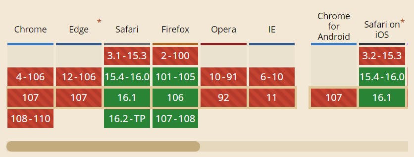
vi and vb | These are quite new and still not supported by most of the browsers. |
vi – (Viewport Inline) 1% of the viewport’s size in the inline direction vb – (Viewport Block) 1% of the viewport’s size in the block direction
Both
vi and vb depends upon the writing-mode property.
By default writing-mode is set to writing-mode: horizontal-tb . In deafult condition
vi will work as vw and vb will work as vh. But if we change
writing-mode to writing-mode: vertical-lr , vi will act as vh and vb will act as vw.
By default the direction in which our written text goes is taken as Inline Direction.
Viewport Modifiers
Before this first undertsand User Agent.
User Agent - default viewport
This contains browser specific size different properties.
For e.g-> vw can be different for the same screen size , but with different browsers.
s Modifier (sv*)
s Small(Smallest Possible Viewport Unit )
No matter what our Browser UI is , like showing URL visible or not , it will always show Smallest Possible Viewport Size so that developer's designs fill the entier viwport even after changing Browser UI like hiding or displaying URL bar or it can be anything like this (not only URL specific ).
(svw ,svh , svmax , svmin , svb and svi) or (sv*)
l Modifier (lv*)
l Large(Largest Possible Viewport Unit )
It is used for largest possible viewport units in the browser.
(lvw, lvh , lvmax , lvmin , lvb and lvi) or (lv*)
d Modifier (dv*)
d Dynamic (Current Viewport Size)
Size will constant. lt will change as we change the viewport and choose it viewport units size smallest or largest depending on the condition.
We use all these modifiers just before any of the mentioned 6 sizing units above in this article (
vw , vh , vmax , vmin , vb and vi) or (v*)
for e.g->svw , dvh etc.
If we don't use any modifier then browser will automatically select any one modifier according to its usecase.
Comment if I have committed any mistake. Let's connect on my socials. I am always open for new opportunities , if I am free :P

 [
[